
Why is a logo important?
What a logo does for a business: recognition, trust, memory and consistency. What it cannot do, what makes a good one, and the mistakes founders make.
Key takeaways
- A logo matters because it is the fastest way for people to recognise your business and tell it apart from others.
- A logo is a signature, not a brand. It collects meaning from everything else you do, and has little of its own at the start.
- A good logo is simple, distinctive, and works at the size of a favicon, the size of a building, in one colour and in motion.
- A logo cannot fix a weak product, explain your business, or carry a brand on its own.
- Test a logo in the places it will actually live before you commit to it.
A logo is important because it is the quickest way for people to recognise your business and tell it apart from others. It works like a signature: it says who made this, and over time it collects every experience people have had with you. What a logo cannot do is make people trust or like you. That comes from the product, the service and everything else the brand does.
So a logo is necessary, but it is not enough. This guide covers what a logo does, what it does not, what makes a good one, and the mistakes we see founders make most often at BUNQ LABS, where we design brand identities and build immersive websites.
What does a logo actually do for a business?
A logo does five jobs. None of them is glamorous, and all of them matter.
Recognition
People do not read logos. They spot them. On a shelf, in an app store, in a crowded inbox or on a street, a clear mark lets people find you in a fraction of a second. The simpler and more distinctive the shape, the faster that happens.
Trust
A clean, consistent logo signals that someone is looking after the business. It does not create trust on its own. But a messy, amateur or inconsistent one can lose trust before a customer has read a word.
Memory
A logo is a hook for memory. Each good or bad experience gets attached to it. Over years, that small shape comes to stand for everything a customer knows about you. This is why a logo seems to be worth more as time passes. It is not the drawing that gains value. It is what people have learned to associate with it.
Differentiation
In most markets, competitors look alike. A distinctive logo is one of the few things that makes you look like nobody else. That matters most where the products themselves are hard to tell apart.
Consistency and ownership
A logo marks things as yours: the invoice, the packaging, the app, the uniform. Used the same way everywhere, it ties scattered touchpoints into one business. It is also something you can protect as a trademark.
Is a logo the same as a brand?
No. A logo is one mark. A brand is what people think and feel about your business, built from every experience they have with it. The logo is the label on the jar, not what is in it.
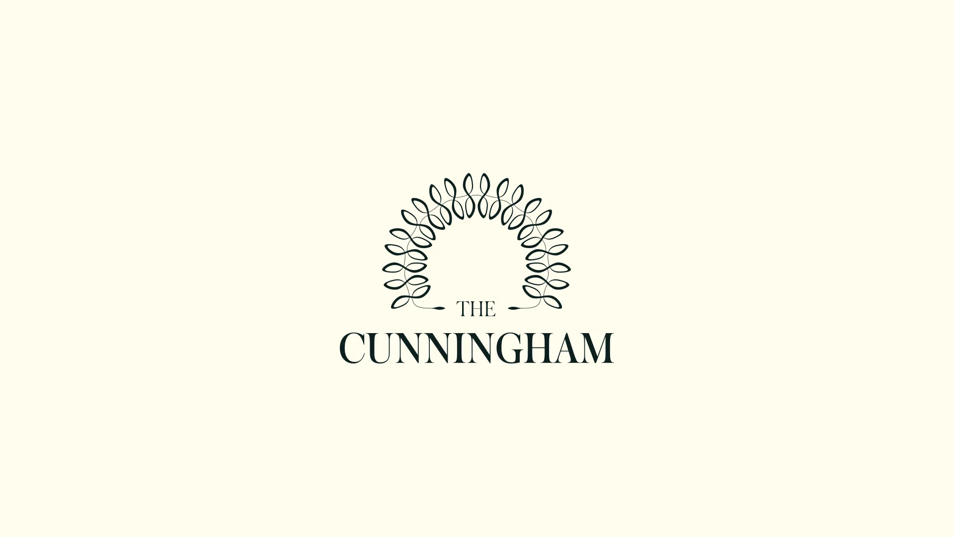
The Cunningham, a hotel in Bangalore we branded, shows this clearly. Its logo, an arc drawn from a jasmine braid, appears on almost nothing inside the hotel. Items that leave the building, like business cards and tote bags, carry it. Items that stay inside, like slippers, bottles and candles, carry only a pattern made from the same unit. The brand is everywhere. The logo is almost nowhere. You can see the system at /projects/tch.
For the full difference between the terms, read logo vs brand identity vs branding.
“People do not read logos. They spot them.”
What makes a good logo?
A good logo is not the one you like most in a presentation. It is the one that works in every place it will live. Check it against these:
- Simple. It can be recognised at a glance and sketched from memory.
- Distinctive. It does not look like your competitors, or like a stock icon.
- Works small. It holds up as a favicon, an app icon or a social avatar.
- Works large. It holds up on a sign, a billboard or the side of a building.
- Works in one colour. It survives being printed in black, embossed, engraved or reversed out of a photo.
- Works in motion. It can animate, or be built in 3D, without falling apart.
- Fits the story. It comes from something true about the business, not a trend.
Two of our own projects show these tests at work.
The Tesels mark is a single operation: a circle subtracted from a square. It will most often appear as a small credit inside other companies’ configurator interfaces, so it had to survive being tiny. It reproduces cleanly in one colour at any scale, and that mattered more than how it looks large. The project is at /projects/tesels.
The Cunningham mark went through 200 to 300 iterations before it was settled. The single jasmine bud alone went through 10 to 20 variations, tested large and small, in lines and in arcs. That is what it takes to make a detailed mark hold up at every size.
Do logos still matter in a digital, moving world?
More than ever, but they have to do more. A logo now has to work as a tiny icon in a browser tab, move in a video intro, and sometimes exist in three dimensions.
On Why Zero, the website we built for Zero University, the logo is never placed on the page as a flat graphic. In the fourth stage of the experience, the visitor flies through a tunnel, and that tunnel is the Zero mark extruded into 3D. The logo becomes a place you travel through. That only works because the mark is simple enough to survive being turned into geometry.
What can’t a logo do?
Founders often expect too much from a logo. Here is what it cannot do:
- It cannot fix a product problem. If customers leave because of price, quality or service, a new logo changes nothing.
- It cannot explain what you do. Very few great logos describe the product. Your name, your words and your website do that.
- It cannot create meaning on day one. A new logo is close to empty. Meaning builds through use and experience.
- It cannot carry a brand alone. Type, colour, voice, imagery and behaviour do most of the work. A logo with nothing around it looks thin.
What mistakes do founders make with their logo?
These come up again and again:
- Too much detail. Fine lines, gradients and small text disappear at small sizes.
- Following a trend. What looks current this year looks dated in a few.
- Designing for one screen. A logo approved on a large monitor can fail as an app icon.
- Putting it on everything. More logo does not mean more brand. Restraint often reads as confidence.
- No rules. Without guidelines, teams stretch it, recolour it and crowd it.
- Changing it too often. Every change resets some of the recognition you have built.
- Deciding by committee or personal taste. Ask whether it works, not whether everyone likes it.
- Skipping the trademark check. Find conflicts before launch, not after.
- Not getting the files. You need vector files and versions for dark backgrounds, light backgrounds and small sizes.
How do you test a logo before you commit?
Run it through the real world before you sign off:
- Shrink it to favicon size and see if it still reads.
- Print it in black only, then reverse it to white on black.
- Place it on a busy photograph.
- Put it beside your three closest competitors.
- Mock it up on your biggest likely use, such as a sign or a stand.
- Animate it, even roughly, and see if the idea survives.
If it passes all of these, you have a logo that can do its job. If you are unsure whether you need a logo, a refresh or something larger, our guide on when to rebrand may help.
If you want a logo that is built to work everywhere it has to live, get in touch.
Questions
Frequently asked questions
Does a small business really need a logo?
Yes, but it does not need an expensive one on day one. A clear, well-set wordmark that is used the same way everywhere does most of the job, and it can grow into a fuller identity later.
What makes a logo memorable?
Simplicity, distinctiveness and repetition. A simple shape that looks unlike your competitors, used the same way every time, is what people end up remembering.
Should my logo show what my business does?
It does not have to. Many of the best-known logos say nothing literal about the product. A logo earns its meaning over time from the experience behind it.
How many versions of a logo do I need?
Usually a primary logo, a compact version or symbol for small spaces, and one-colour versions for dark and light backgrounds. Each should come with rules for spacing and minimum size.
How much does a logo cost?
It depends on how much thinking sits behind it. A mark designed on its own costs less than one designed as part of a full identity system, with strategy, testing across real applications and guidelines.
Can I change my logo later?
Yes, and many businesses refine theirs as they grow. The safest changes keep something people already recognise, such as the colour, the shape or the name.
Newsletter