
How to design a flexible brand identity system
How we built a brand identity for Oddity, a house for many artists: colour instead of shapes, a loud custom typeface, and a 150 page rulebook.
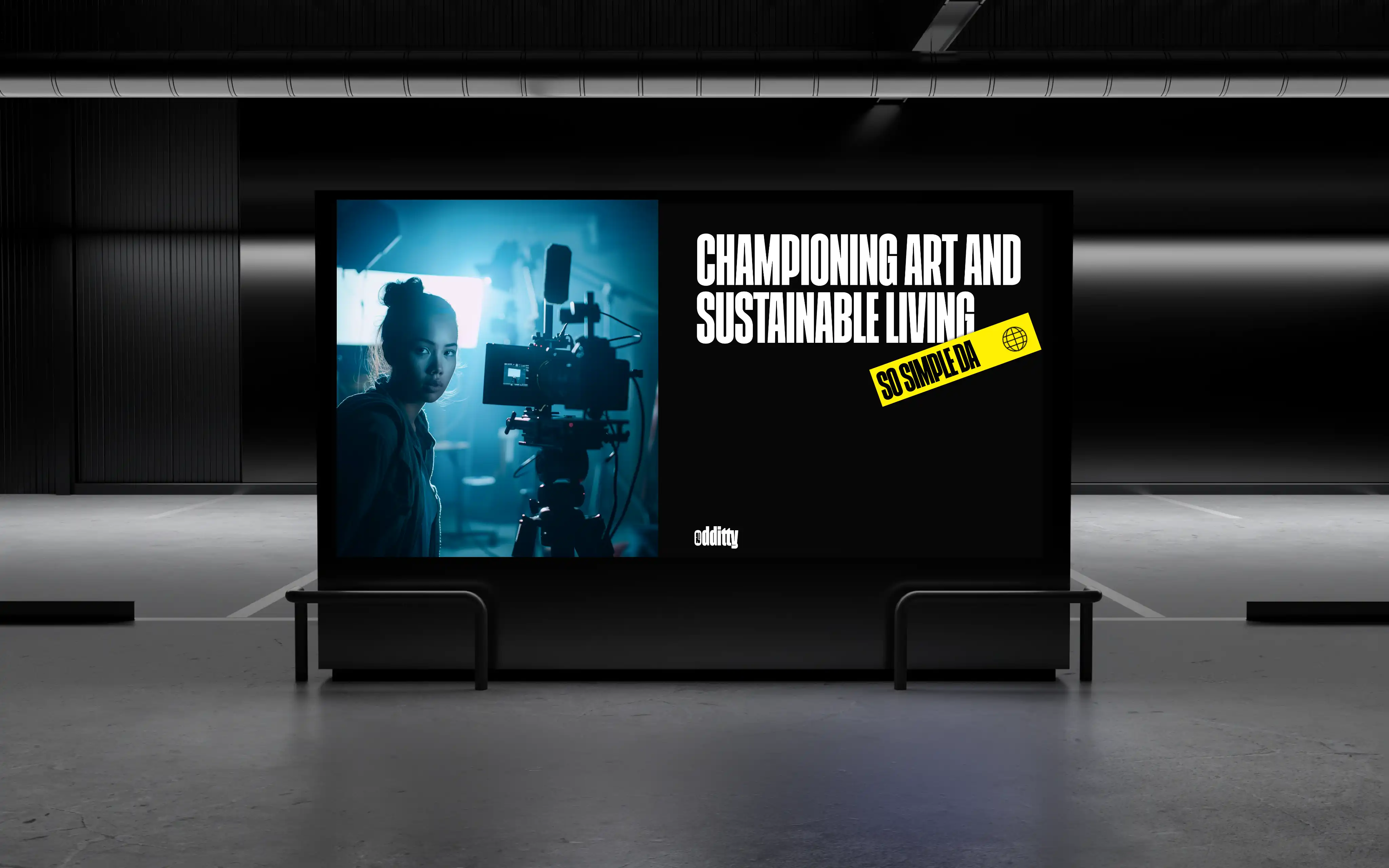
Key takeaways
- A brand that has to hold many voices should have very few of its own.
- Let colour identify the brand, because colour is the one asset that never competes with the work it sits behind.
- A flexible brand needs more rules than a rigid one, written down with unusual precision.
- A heavy enough typeface can stop being typography and become the artwork itself.
- Some product features can only be sold by handing them over, so give the visitor the switch.
To design a brand identity system that can flex without falling apart, give the brand very little style of its own. Let colour and type do the identifying, and leave shape to the work the brand carries. Then write the rules down in great detail, because a loose system only holds together when its edges are precise.
We learned this building Oddity. Oddity is a premium decor brand that works as a house for artists. The artists make the work. Oddity makes and sells it, names each artist, and pays them a royalty on every unit sold.
Its best-known product is Halo, a backlit photo frame that carries an artist’s poster. It comes in several sizes. The range now includes other objects for the desk and the home. The full case study is at /projects/odditty.
Why can’t a multi-artist brand have a fixed aesthetic?
Oddity did not arrive with a fixed style. It could not be given one either.
The whole idea is work from many artists with very different tastes. A brand built on one look would smother that work. It would also break the first time an artist arrived whose work did not fit.
So the brand had to flex as far as possible and still look like Oddity. It had to hold one artist’s poster and another’s. It had to hold a desk object, a backlit frame and whatever the company makes next. None of it could look like it belonged to a different company.
This is the problem for most marketplaces, collectives and curated brands. The product is other people’s work. The brand has to frame it, not compete with it.
How do you build a brand identity with almost no shape language?
The usual instinct in branding is to add. A shape, a device, a pattern, a graphic language. For Oddity, each of those would have been one more thing for the artwork to fight.
So the system uses almost no shapes. We did not invent a proprietary graphic device. We did not build a pattern library.
We did refine the existing logo rather than replace it. We designed a set of supporting symbols around it. That kept the value the brand had already built and gave the system somewhere to grow.
Holding back here was not a style choice. It was the only way the system could work.
“Give the brand very little style of its own. Let colour and type do the identifying.”
What should identify a brand when shape cannot?
Colour. We chose colour to identify Oddity because it is the one brand asset that never fights the artwork. A gradient can sit behind any poster in the library without clashing with it.
The system has an extensive palette. It also has a large family of refined gradients, built for packaging, print and screens.
Why we rendered the gradients in Blender
We generated the gradients in Blender rather than drawing them in a vector tool. Rendered gradients have the depth and falloff of real light. Drawn ones have the flatness of an interpolated ramp.
It is a small decision with a large effect. A gradient built from light behaves like a material. A brand made almost entirely of colour needs its colour to have some physical presence.
How can a typeface carry a flexible brand?
If shape belongs to the artists, type has to work harder. We commissioned a custom typeface for Oddity. It is loud and confident. It is closest in feel to Impact, but distinctly its own.
We built a full hierarchy around it. The hierarchy sets how the heavy display weight sits beside everyday functional text.
Word treatments and stickers as artwork
At that weight, the type stops behaving like typography. It starts behaving like a graphic.
So alongside the typeface we made an extensive library of bold word treatments and stickers. A single word, set in the brand’s own face, becomes a complete piece of artwork. It works for packaging, marketing and social.
Most of Oddity’s marketing is one word, set well. That gives the brand a loud voice without adding a single shape that could clash with an artist’s poster.
The icon system
We also delivered a complete icon system. The icon set is documented in the brand book alongside the mark, the colour and the type, so it follows the same rules as everything else.
Why does a flexible brand need a longer brand book?
Everything for Oddity lives in a brand book of about 150 pages. It covers the mark and its supporting symbols, the colour and gradient system, the type hierarchy, the icon set, the graphic language, and how the brand applies across every surface the company uses.
That length was necessary, not indulgent. A brand designed to flex needs its rules written with unusual precision.
A rigid brand polices itself. There is one way to do things, and anything else looks wrong. A permissive brand has many right answers. Without clear edges, it drifts into incoherence within a quarter.
The more freedom a system allows, the more exactly you have to say where that freedom ends.
What principles can you apply to your own flexible brand?
These are the principles we would hand to any founder or brand lead running a marketplace, a collective, or a curated or multi-product brand.
- Start from what the brand carries. Ask what the product actually is. If it is other people’s work, the brand’s job is to frame it.
- Remove shape before you add it. Every proprietary device is something the work has to argue with. Keep only what earns its place, such as a refined mark and a few symbols.
- Let colour do the identifying. Colour sits behind anything without clashing. Build a wide palette and a family of gradients, not one signature colour.
- Give the colour physical presence. If colour is the brand, make it feel real. We rendered ours as light in Blender.
- Make the type loud enough to be a graphic. A heavy custom face lets one word become a finished piece of artwork.
- Write the rules down at length. Flexibility without documentation becomes inconsistency. Define the edges exactly.
- Define the audience by taste. We defined Oddity’s audience as people aged 20 to 35 who work in or near art and design. It is broad, but coherent: people who want the strange object, not the safe one.
How should a flexible brand’s website work?
The website had two jobs that usually pull apart. It had to be a working store with a catalogue the client manages themselves. It also had to feel as strange and delightful as the brand.
Most projects pick one. This one could not. The clearest moment of that ambition is a scroll sequence that carries visitors out into the Oddity universe, with a large planet suspended in the exterior.
A store the client controls
We built on Webflow so Oddity could run its own site day to day without waiting on us for every content change. For a company that keeps adding new artists, that mattered more than any performance argument. Animation uses GSAP, Webflow’s own interactions and a substantial amount of custom code.
Commerce runs on Shopify as a headless backend, connected through Shopyflow. The client operates Shopify exactly as they otherwise would. Inventory, orders and fulfilment stay in the system their operations already run on. We built the front end that sits on top.
The Halo configurator and the backlight switch
Halo had to be understood before it could be sold. So we built a configurator with three controls. Visitors can change the frame size and watch the product update live. They can cycle through the artist library. And they can switch the backlight on and off.
That last control does most of the work. Halo’s defining quality is that it glows. No photograph shows the difference between a lit frame and an unlit one.
We could have written about the backlight, or photographed it glowing. Both would be true, and neither would work. Handing visitors the switch lets them discover it themselves. That took far less persuading and did far more of it.
Halo also got its own immersive landing page, with all the 3D made in Blender. The main site sells a brand and a catalogue. This page sells one object properly.
Why does a flexible brand system take more rounds than a fixed one?
Because more has to be decided, and decided precisely. For Oddity, the work ran from the brand system all the way to a live store, and the website went through two to three full versions.
That iteration count reflects the ambition, not a lack of direction. A brand without a fixed aesthetic, a store that had to be immersive, and a product nobody had seen before all had to be solved together. The versions were how that happened. You can see the finished system at /projects/odditty, and the full range of what we do at /services.
Building a brand that has to hold many voices?
If you run a marketplace, a collective or a curated brand and the system keeps fighting the work it carries, we would be glad to talk it through. Get in touch and tell us what you are building.
Questions
Frequently asked questions
What makes a brand identity system flexible?
A flexible system carries very little of its own visual style, so it can hold very different work without clashing. For Oddity, that meant almost no shape language, with colour and type doing the identifying.
How do you keep a flexible brand consistent?
You write the rules down at length. Oddity's brand book runs to about 150 pages, because a permissive system drifts into incoherence within a quarter if nobody says exactly where its edges are.
Should a marketplace or artist collective have its own visual style?
It should have very little. Every shape or pattern the brand adds is one more thing for the artists' work to argue with, so restraint is what lets the system work.
Why render brand gradients in 3D software instead of drawing them?
Gradients rendered in Blender have the depth and falloff of real light, rather than the flatness of a ramp drawn in a vector tool. When a brand is made mostly of colour, that colour needs physical presence.
Which platform should a brand use if it wants to manage its own store?
For Oddity we chose Webflow so the client could run its own catalogue and content, with Shopify as a headless backend connected through Shopyflow. Stock, orders and fulfilment stayed in the system the team already used.
Newsletter