
Does your brand need an immersive 3D website?
When an immersive WebGL website is worth building and when it is not, with worked examples from Why Zero, House of Samuha and Tesels.
Key takeaways
- An immersive 3D website is worth it when the product cannot be shown in a photograph, the argument has to be felt, or the medium itself proves the claim.
- If a good photograph and a clear paragraph already sell the product, a conventional website is the better choice.
- Performance is a design decision made at the beginning of a project, not a fix applied at the end.
- An immersive site should be built for the devices its audience actually holds, not for the hardware in the studio.
- An immersive layer can sit on top of a CMS such as Webflow, so the client still updates its own content.
An immersive 3D website is worth building when your product cannot be shown in a photograph, when your argument needs to be felt rather than read, or when the website itself can prove what you claim. If none of those is true, a well made conventional site is usually the better call. The rest of this guide explains how to tell the difference, using three sites we built.
What is an immersive 3D website?
An immersive website uses real time 3D graphics in the browser, usually through WebGL. The visitor does not just read a page. They move through a scene, touch objects, and change what they see.
That is powerful. It is also more work to design, build and keep fast. So the question is never “would it look impressive?” It is “does the medium do a job that nothing simpler can do?”
When is an immersive website worth it?
In our experience, the answer is yes when at least one of three things is true. Each of the projects below shows one of them clearly.
When the product cannot be photographed
House of Samuha hosts private supper clubs for corporate clients. Each one pairs a handpicked chef with an unusual place: a working farm, a granite quarry, a resort. Chefs are chosen for each event. Venues are found rather than booked.
That makes the product almost impossible to show. It cannot be sampled. It cannot be adequately photographed. It cannot be explained on a menu. A client has to picture an evening that has not happened yet.
A conventional site, however well shot, would have sold the company short. So we did not try to show the dinner. We built somewhere to imagine it.
The House of Samuha site is built around one object: an oval metal platter with the logo debossed into it. It stays at the centre of the screen from the first frame to the last. Behind it, a custom shader draws slow fog that never visibly repeats.
Scrolling carries the visitor into a spiral of video frames from real past events. Then come angled walls, one per chef, with a portrait mounted above each. The site ends on a slider of venues and one question: where would you want yours?
The platter matters for a practical reason. A site made of separate scenes can feel like four unrelated demos. One object that never leaves gives the whole experience a spine.
When the argument has to be felt
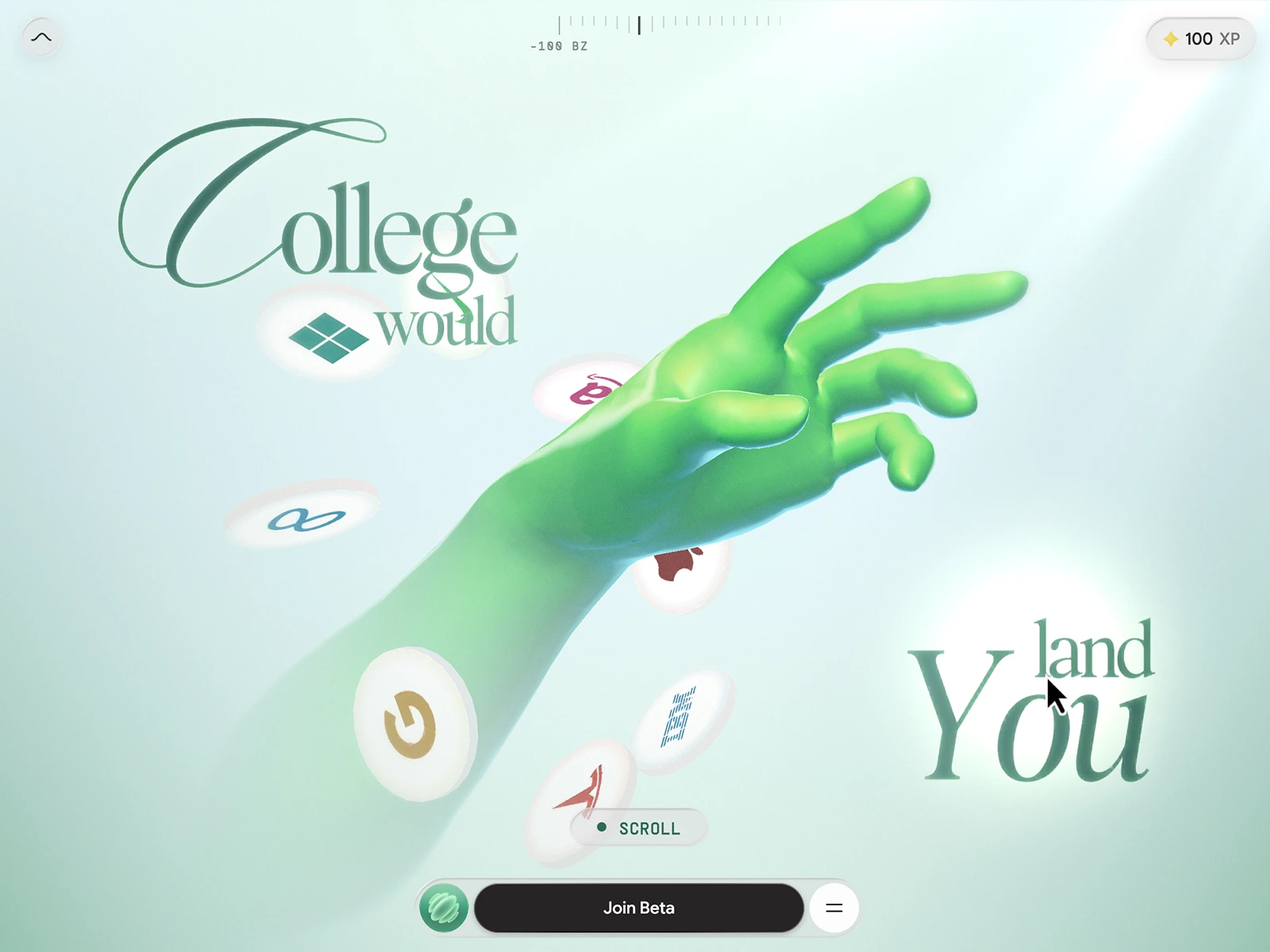
Zero University believes the conventional degree has stopped delivering what it promises. They did not want a website that explained this. They wanted one that placed visitors inside the argument and left them somewhere unexpected.
So Why Zero is told as six stages. You enter by drawing a zero across a sheet of ice until it cracks. Two hands reach for each other, one gold and covered in company logos, one human. Then the scene shatters and you fall through a red void.
As you fall, glass shards rise past you carrying unemployment figures and data on graduate outcomes. Statistics like these rarely survive being listed on a page. They survive being met one by one, on the way down.
Each stage is separated by a gate. You draw, hold or press to move on. That deliberate act is what stops six stages from becoming a passive scroll.
This is the case for immersion at its strongest. The client was not selling a feature. They were changing a belief. Interaction made the visitor a participant before they had read a single line.
When the medium proves the claim
Tesels is a 3D product configurator platform. Brands use it to run photorealistic, interactive configuration on their own websites. Its claim is that the output stays performant on entry level hardware, on the phone a customer is actually holding.
A configurator company can describe that claim. Or it can hand the visitor a configurator. On the Tesels homepage, we chose the second.
The hero holds a live mini configurator built around a watch. A visitor can change the configuration in a few clicks and open an exploded view, before reading any copy. The whole model ships at under 300 KB and loads in under a second on reasonable hardware.
That figure is the argument. Anyone comparing configurator vendors has likely sat through heavy, slow demos elsewhere. A photoreal object that simply responds within a second makes the case before any feature list. A demonstration beats a description, and it beats it early.
“The question is never ‘would it look impressive?’ It is ‘does the medium do a job that nothing simpler can do?’”
What should you check before you commit?
Immersion only works if the practical side holds up. These three questions matter as much as the creative idea.
Who is your audience, and what are they holding?
Why Zero’s audience spans every economic bracket in India. Many of them hold inexpensive, ageing phones. A site that only worked on flagship hardware would have contradicted the very thing it was built to say.
So we borrowed a four year old budget Tecno Pova with a Mali class GPU. It stayed on the desk for all five months of the build. The client arrived with roughly 1.5 GB of models and textures. The shipped site is under 10 MB, and it runs at 50 to 60 FPS on that phone.
The site also checks its own frame rate. If performance drops for a sustained period, it steps down a quality tier on its own. The visitor never chooses a setting and never sees it happen.
Is performance a constraint from day one?
That result was not found at the end. It came from setting the benchmark in the first week and letting it veto decisions for five months. Optimisation left until the end is why so many ambitious sites arrive slower than intended.
If a studio treats speed as a final polish, an immersive site will likely feel heavy. If speed shapes every decision, it can feel effortless.
Can your team still update the content?
An immersive site is no use if every change needs a developer. House of Samuha runs on Webflow, with custom code driving the Three.js layer. The company updates its own chefs, venues and events, while the experience around them stays exactly as built.
Oddity, a decor brand we worked with, is built the same way. Webflow was chosen so the client keeps day to day control of its own catalogue. For a company adding new artists all the time, that mattered more than any performance argument would.
A quick checklist: do you need an immersive website?
Answer each question honestly. If you cannot say yes to at least one of the first three, a conventional site is probably the better choice.
- Is your product hard or impossible to show in a photograph?
- Does your message need to be felt or experienced, not just read?
- Would the website itself prove what you claim?
- Do you know which devices your audience actually uses?
- Will performance be set as a constraint at the start, not checked at the end?
- Can the site sit on a CMS your team already uses to update content?
- Is there one clear idea or object that can hold the experience together?
When should you not build an immersive website?
Immersion is a tool, not a status symbol. Here is when we would steer a client away from it.
- When a photograph already does the job. If a good image shows your product clearly, 3D adds weight without adding meaning.
- When the message works as text. If a clear paragraph makes the case, making people scroll through scenes to reach it gets in the way.
- When the 3D proves nothing. Every effect should serve the argument. If it would only decorate, leave it out.
- When performance cannot be built in from the start. A heavy site that stutters on your audience’s phones undermines the brand it is meant to lift.
- When nobody can update it. If the build would lock your team out of its own content, a simpler site you control is worth more.
In these cases, the same budget is usually better spent on a fast, clear conventional site. That is not a lesser outcome. It is the right one for the job.
How we approach the decision
We start with what the website has to do, not with the technology. Sometimes that leads to six interactive stages. Sometimes it leads to a single platter in fog. Sometimes it leads to a configurator in the hero that weighs almost nothing. And sometimes it leads to a conventional site. You can see the full range of what we do on our services page.
If you are weighing this decision for your own brand, we are happy to talk it through. Tell us what you are selling and who you are selling it to, and we will give you an honest view. You can reach us at our contact page.
Questions
Frequently asked questions
When is an immersive 3D website worth the investment?
When the product cannot be properly photographed, when the message needs to be felt rather than read, or when the website itself demonstrates what the company sells. If none of these is true, a conventional site usually does the job better.
Will a WebGL website work on cheap phones?
It can, if performance is set as a constraint from the first week. Why Zero shipped 1.5 GB of source assets in under 10 MB and runs at 50 to 60 FPS on a four year old budget Android.
Can we update an immersive website ourselves?
Yes, if it is built that way. House of Samuha and Oddity both run on Webflow, with the immersive layer added in custom code, so each company edits its own content.
How long does an immersive website take to build?
It depends on the scope. Among our own projects, House of Samuha went from concept to launch in three months and Why Zero in five.
When should we not build an immersive website?
When a photograph already shows the product well, when the message works as plain text, or when the 3D would add weight without proving anything. In those cases the effort is better spent on a fast, clear conventional site.
Newsletter